If you haven't noticed the new design, you're either new to CSS-Plus or you have hit ctrl / cmd + r in a while. I've been talking about a redesign for longer than I'd like but it's finally here, however it's not 100% complete yet. You may notice that things look a little funky here and there, but don't worry, I'm working on it! It should be complete within this week.
What's new?
In general the font is larger, the headings are larger, the website is fluid (Or will be once I'm done). My main objective was the make the the website easier to read, easier to navigate and more enjoyable to be on.
Colour palette
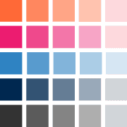
I've decided to go largely with the blue and pink. The colour palette consists of 5 colours: Orange, pink, light-blue, navy blue and grey. I've decided to go with a very light template compared to the previous one. I feel it's much easier to read and more enjoyable to be on a lighter website. Darker colour palettes can work, but I don't feel they really work on blogs.
The logo

After messing around with many types of logos, I noticed that the 'P' in CSS-Plus could contain a plus symbol if I were to extend it a bit. I think it looks pretty cool. Other than that, the font used was '
Cantarell'.
Where did the tags go?
The tags are still there, I've just removed all links to them. Ultimately I'm going to remove them completely because I don't really think they serve a real purpose. The analytics agreed with me.
Navigation and Sidebar
I've realized that it's been a bit tough to navigate the site easily.
The sidebar now includes most popular articles, the latest articles and my latest plugins — I plan on making a handful of very useful jQuery plugins.
Search here...
I've always had a search bar but it was barely used. Also, the results page was pretty nasty... Perhaps that's the reason it wasn't used all that much? Anyway, I've implemented the new GSE code and the results are much easier on the eye.
Article Thumbnails
I've started using the Wordpress thumbnail feature. I think it makes everything much more interesting to look at. At largest they are 180x180 images with a border, drop shadow and inner shadow. The more CSS I used, the more control I have over everything.
Pretty comments
I quite like the new comments. I've made them much more orderly, easier and more enjoyable to read.
The footer
The footer is largely the same. I've replaced the latest tweet area with my delicious links. I think they are much more useful than what I've said last on twitter.
Social
The latest additions to the social family has been the Google +1 button and a link to my Github account. Why +1? Because I think Google is absolutely awesome.
Images and javasript has been avoided
I haven't avoided images as
much as possible, but I have tended towards avoiding them. They aren't necessary (Excluding fallback images) and it's fun making everything as semantic as possible. As for javascript, it's overkill for something that CSS can easily and semantically do, such as the hover effect in the footer.
Suggestions?
Let me know if you have any suggestions.
