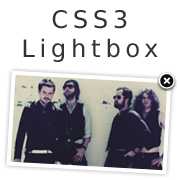
The days of using javascript lightboxes are over!
Just kidding,javascript lightboxes remain a much more efficient and cross-browser friendly way of doing achieving the lightbox effect. This CSS3 lightbox tutorial is for demonstration purposes only. I'm doing this because it's interesting to see how far you can push CSS and you end up learning quite a lot. I do at least.
The HTML
The HTML isn't very semantic at all.
<div id="page-wrap">
    <div id="lightbox">
        <div id="img1">
            <img src="images/beatles.gif" width="920" alt="" />
            <a class="close" href="#"></a>
        </div>
        <div id="img2">
            <img src="images/brand-new.jpg" width="520" alt="" />
            <a class="close" href="#"></a>
        </div>
        <div id="img3">
            <img src="images/the-killers.jpg" width="920" alt="" />
            <a class="close" href="#"></a>
        </div>
    </div>
    <ul id="gallery">
        <li>
            <a class="clearfix" href="#img1">
                <img src="images/beatles.gif" alt="The Beatles" width="200" />
                <span>The Beatles</span>
            </a>
        </li>
        <li>
            <a class="clearfix" href="#img2">
                <img src="images/brand-new.jpg" alt="Brand New" width="200" />
                <span>Brand New</span>
            </a>
        </li>
        <li>
            <a class="clearfix" href="#img3">
                <img src="images/the-killers.jpg" alt="The Killers" width="200" />
                <span>The Killers</span>
            </a>
        </li>
    </ul>
</div>
As you can see, there is quite a lot of markup, some of it even looks — and is — unnecessary, such as <a class="close" href="#"></a> which appears as many times as there are lightbox images.
There are obviously no "for each", "append" or "prepend" functions in HTML or CSS so all of this is done manually. Each gallery image-thumbnail has a corresponding lightbox image. Each lightbox image contains a close button. I've also set a width to the gallery images, this forces a width but allows for a dynamic height while keeping the image in proportion.
The <span> elements are going to be used as a caption.
The CSS
#page-wrap {
    margin: 0 auto;
    position: relative;
    width: 980px;
}
#gallery {
    display: table;
    margin: 0 auto;
}
#gallery li {
    float: left;
    margin: 10px 20px 0 0;
    position: relative;
}
#gallery span {
    background: rgba(0, 0, 0, 0.7);
    opacity: 0;
    padding: 10% 0;
    width: 100%;
    text-align: center;
    position: absolute;
    left: 0;
    bottom: 0;
    -moz-transition: opacity 0.6s ease-in;
    -o-transition: opacity 0.6s ease-in;
    -webkit-transition: opacity 0.6s ease-in;
}
#gallery li:hover span {
    opacity: 1;
}
#gallery a {
    border: 5px solid rgba(0, 0, 0, 0.1);
    display: block;
    position: relative;
    -moz-transition: border 0.6s ease-out;
    -webkit-transition: border 0.6s ease-out;
    transition: border 0.6s ease-out;
}
#gallery a:hover {
    border: 5px solid rgba(39, 25, 0, 1);
    border: 5px solid rgba(0, 0, 0, 0.5);
}
#gallery a:focus {
    -moz-transform: rotate(-2deg);
    -webkit-transform: rotate(-2deg);
    transform: rotate(-2deg);
}
#gallery img {
    float: left;
}
#lightbox div {
    background: #fff;
    border: 30px solid #fff;
    opacity: 0;
    position: absolute;
    left: 0;
    top: 6%;
    z-index: 0;
    border-radius: 10px;
    box-shadow: 0 0 40px rgba(0, 0, 0, 0.4);
    -webkit-transition: all 0.3s ease-out;
    -moz-transition: all 0.3s ease-out;
    transition: all 0.3s ease-out;
}
#lightbox div:target {
    opacity: 1;
    z-index: 10;
}
#lightbox img {
    float: left;
    border-radius: 3px;
}
#lightbox #img2 {
    left: 15%;
}
#lightbox a {
    background: url(../images/close.png) no-repeat left top;
    height: 28px;
    width: 30px;
    position: absolute;
    top: -42px;
    right: -42px;
}
Al right, time to break this thing down.
#gallery {display: table; margin: 0 auto} - This centres something that has a dynamic width. Yes that's right folks, if you add another item it will still be centred. Very awesome, simple and handy.
I've set the transition property on #lightbox div to 'all'. Why not just do this for opacity? Because the z-index also needs to be animated. If transition isn't applied to z-index, it fades away after immediately falling beneath a couple of elements. I had no idea you could apply a transition to z-index before this. After tinkering for a while I finally gave it a try and it works perfectly in Firefox 4 and Webkit.
What is :target
The pseudo class that is responsible for this whole experiment is `:target. Target is quite a simple concept, and it can really broaden your ideas as to what CSS can actually do.
Let's say you have a url: [http://css-plus.com/] Whatever CSS properties you apply to:
#footer:target {
    /* Apply properties here */
}
Will affect #footer when the url changes to this: [http://css-plus.com/#footer]
Therefore, when you click the "back" button on your browser after clicking around for a while in the demo
How does this work in almost-plain-English?
You click an anchor link with a hash value equal to that of an ID. Once this happens, the :target pseudo-class kicks in and the properties it contains take effect. The transition property on the ID then takes effect
The close button isn't really a "close" button. It's an anchor link that contains a different hash value to the value in the in the URL. Once this "close" button is clicked, the previously :targeted id is not targeted any more. Therefore it loses the z-index and opacity properties that were applied to it. Once this happens the transition property takes affect again and this creates the "fade out" effect.
Problems I ran into
I wasn't able to recreate the transparent black overlay that normally accompanies a lightbox. - I'm sure there is a way of doing this, I just haven't figured it out yet. If you know of a way let me know and I'll update this.
Conclusion
This was a fun experiment which shows you that there are many things that can be done with CSS.
