

Recently, someone asked me how they would go about creating a "fading border". I can't recall ever seeing one, so I decided to create this tutorial.
What exactly is a 'fading border with opacity focus'? At first I created a really long-winded version. The jQuery javascript was about equally as long as this version, but the CSS was about 10 times larger and I managed to halve the amount of markup. The one thing this version has lost, however, is the box-shadow on hover (Which I think looked great). The fading border without a box-shadow seemed bland, which is why I've added the opacity focus. In this tutorial you will learn how to create an awesome 'fading border' and stylish opacity focus with minimal HTML, ridiculously little CSS and easy to understand jQuery javascript. Alright, let's get started.
The Markup/HTML
<ul>
<li>
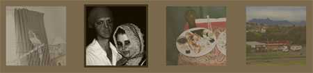
<a href="images/bird.jpg" title="Parakeet"><img src="images/thumb-bird.jpg" alt=""/></a>
</li>
<li>
<a href="images/halloween.jpg" title="Halloween"><img src="images/thumb-halloween.jpg" alt=""/></a>
</li>
<li>
<a href="images/sushi.jpg" title="Sushi"><img src="images/thumb-sushi.jpg" alt=""/></a>
</li>
<li>
<a href="images/mountain.jpg" title="Mountain"><img src="images/thumb-mountain.jpg" alt=""/></a>
</li>
</ul>As you can see, this is very standard and simple markup. What we have here is an Unordered List containing thumbnail images that link to another, larger, image. I've added the title attribute because I will be using Fancybox to manage the image anchor links and Fancybox makes use of the this "title" attribute. You should be adding 'title' attributes for SEO purposes anyway. Fancybox is not needed for the fading border or opacity focus to work.
The CSS
As I said before, this contains so little CSS that I find it quite amusing. Especially since it previously contained 2 lines for every image I used and an extra 4 or so lines.
body {
    background: #79694c;
}
li {
    float: left;
}
a img {
    background: #79694c;
    padding: 5px;
    margin: 0 40px 0 0;
}
When you are too close to something you are working on, it is difficult to step back and look at what you are actually doing. I did this and I am amazed. I think I will write an article based on exactly this subject at a later date.
The float property is included to force the <li>s into a horizontal line and the margin-right of 40px is used to separate the <li>s, therefore separating the images.
As you can see, the image doesn't actually have a 'border'. The padding around the image gives it the the illusion that it has a border. Also the padding is the same colour as the background. This is done because we want to give the impression that these images do not contain a border. This way, when we fade to another colour, it looks like the border is fading in and out of existence.
A border of the same colour is needed, otherwise a 'jump' will occur when you hover over it due to a border being added and taken away. This jump is a big indication of a poor web developer.
The jQuery
This part of the tutorial is by far the most complicated (relative to the HTML and CSS). The first thing we need to do is include jQuery, obviously. Once that has been accomplished, a plugin named jQuery Color needs to be linked to in the header. This little plugin makes it very easy to fade background and border colours into one another. And now for the fading border and opacity focus jQuery javascript code:
$(document).ready(function() {
    //Fading Border
    $("ul img").hover(
        function() {
            $(this)
                .stop()
                .animate({ backgroundColor: "#40331b" }, 400);
        },
        function() {
            $(this)
                .stop()
                .animate({ backgroundColor: "#79694C" }, 400);
        }
    );

    //Opacity Focus
    $("ul li").hover(
        function() {
            $(this)
                .siblings()
                .stop()
                .fadeTo(400, 0.4);
        },
        function() {
            $(this)
                .siblings()
                .stop()
                .fadeTo(400, 1);
        }
    );
});
Let's start with the Fading Border, since it comes first in the jQuery. What it's saying is: Once you hover over ul img, animate the background colour to a dark brown; And once you mouse-off, animate the background to a lighter brown (The same colour we we're using before).
The Opacity Focus is slightly different. What this is saying is: Once you hover over the ul li (List items), select the siblings (All of the other List Items) and fade them to an opacity level of 0.4 at a speed of 400 milliseconds; And once you mouse-off, fade the <li>'s back to an opacity of 1 (100% visible).
The .stop() functions are used in order to stop the animation once you mouse on/mouse off. If you didn't have this and you quickly dragged your mouse over all of the images and stopped, the animations would play over and over until it had completed the amount of times you mouse on / mouse off-ed.
The useful thing about this Fading Border with Opacity Focus is that the images can be any size and this will work just fine. I created every thumbnail equal in size because I think it looks a whole lot neater.